


#blog
Choosing the colors of the house: the basic rules for having a harmonious home
/
February 4, 2020
As a good home stylist can advise you, you can start with some basic rules.
There are recommended pairings and others to avoid.
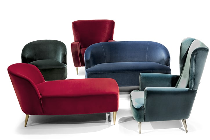
Blue and black are generally prohibited. There are exceptions, such as electric blue that becomes harmonious with black, or pink and red, although they do not seem to be in harmony, they can even become trendy.
The first step to understanding how colors match is to use the Hitten circle.
It is a circumference divided into colors, blue, red and yellow, ie the three primary colors, and the secondary colors, green, purple and orange. These are the colours that derive from the mixing of the primary ones, in the adjacent parts, together with the tertiary ones that arise from the mixing of a primary and a secondary color.
Then there are other colors in the circle born from the shades of both primary and secondary colors.
Starting from this scheme, it is necessary to look for a pair of opposite colors and never belonging to the same category.
It is recommended to avoid combining the shades of the same color. Red, yellow, orange if combined create an uneven effect, as well as blue and green.
Black and white are evergreens and can be combined with any other color.
How to choose how to match colors at home. Contrast or harmony?
When choosing the type of furniture for the home, it is undoubtedly essential to decide the shades of all the elements present, trying to match the colors that are good together.
You can choose between contrast and chromatic harmony.
In the first case, the complementary colors, or those in the opposite position on the Hitten circle, such as red with green, yellow and green, must be combined.
This choice is suitable if you have a very original, modern style, to be used especially in living areas.
The contrast is suitable for the areas where the activities take place everyday, less the sleeping area where as we will see are suitable colors and combinations that favor rest and relaxation.
These two contrasting combinations can always be combined with neutral shades such as white, black and grey.
These colors soften the contrasts and give variety!
If you are looking for a relaxing effect, a competent home stylist would recommend the harmonious combination of colors close on the color circle: blue and indigo or pink, fuchsia and purple.
Plinio’s tips: the home stylist helps you choose between warm and cold colors
Another way to match the colors inside the house is to choose between warm or cold shades and only after combining them with each other.
Cool colors, from green or blue, through yellow, are suitable if you want to furnish a relaxing environment.
Warm colors such as red, yellow and orange, give a cozy and lively touch.
Alternatively, cold tones can be combined with warm and complementary colours.
How to choose a particular shade without regretting it
Often those who start decorating a house think that choosing particular colors can be a beautiful solution, dare with less obvious shades. Often, however, it is braked because it fears that they may be exaggerated and maybe too loud and may become bored over time.
The home stylist, thanks to his experience, can help you in this, in explaining how to make an original choice without regretting it later.
Petroleum blue, for example, is a calming and elegant color and if associated with gold it acquires vivacity and brightness. A suitable solution if you are looking for a glamorous and elegant style.
The acid green gives a touch of freshness to the house and finds an ideal match with neutral colors such as white, écru, beige and gray. Clear, but at the same time bright, lime green is a great choice to embellish especially the kitchen, the bathroom and all the details of the house, such as curtains and textiles. Plinio can explain how this color is particularly suitable to be combined with wood, giving freshness and modernity.
Purple can be combined with dove grey, soft and elegant, perhaps using it to paint the walls. This neutral tone allows you to avoid a too bright effect and dilute the combination.
If you are looking for a pop-style setting, Plinio recommends choosing orange, which allows you to have a bright and lively effect.
How to match the colors of the walls and floor
One aspect to consider when you start decorating and thinking about your home, is how to match the colors of the floor and walls.
In many cases, Plinio took care of the choice of the container of his furniture. A good home stylist can not recommend a good decor without considering the colors of walls and floor. The advice of the home stylist is to combine walls and floors with the rest of the furniture respecting the color tone, combine the cold and warm tones only among them, without ever mixing them!
Another basic principle is to choose neutral colors such as beige, dove grey, gray or cream to contain and enhance a colorful decor.
These tones are suitable if you want to play with colorful furniture; the room becomes a neutral container in which you can indulge in the color of the furniture.
Plinio with his minimal and linear style has become an expert in home styling, especially in advising how to enhance a bare and neutral house giving personality and character to the environments.